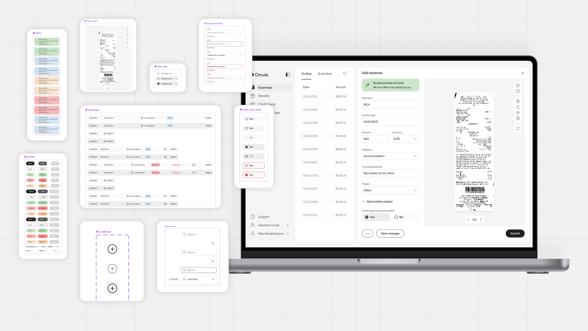
Lunar: Building a Scalable Design System
Transforming a collection of UI components into a comprehensive design system for Web, iOS, and Android.
The situation
When I joined Circula, there was no established design system. A collection of components and some documentation existed, but adoption was inconsistent, many essential components were missing, and most design files didn't use the available library.
The existing components relied on Figma Styles rather than Variables, limiting their flexibility and maintainability. Without clear guidelines or dedicated ownership, designers often had to recreate elements or interpret existing patterns themselves.
This fragmentation also affected collaboration with Engineering. Design components weren't consistently aligned with their implemented counterparts, making it harder to maintain consistency and establish a reliable source of truth.
My initial focus was to organize and document the existing components, creating a reusable library that designers could rely on. What started as an effort to bring order and consistency eventually evolved into a much larger initiative, with Circula's rebranding providing the opportunity to transform the component library into a comprehensive design system.
Challenge & goals
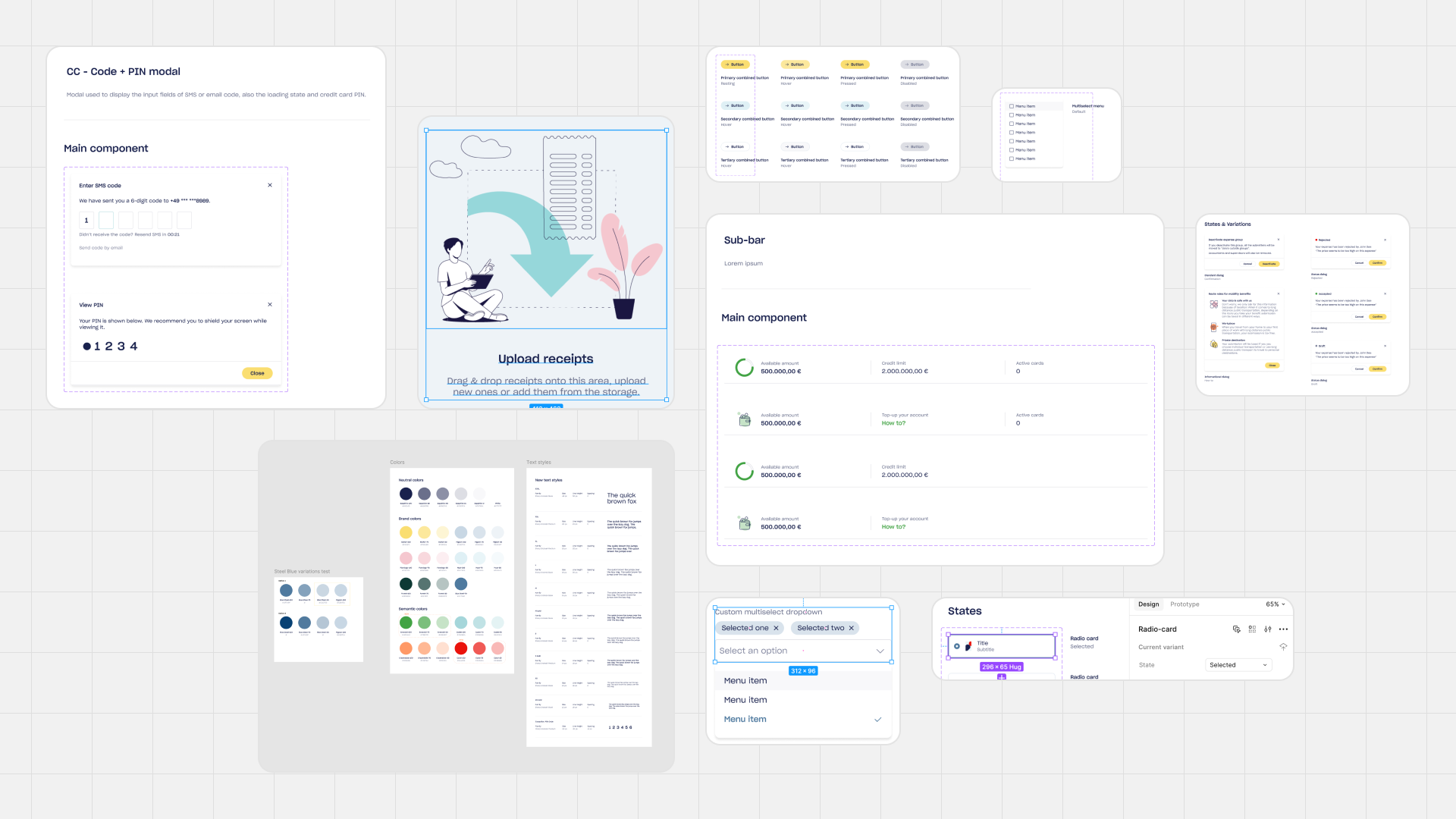
The initial challenge was to establish consistency and make existing components easier to find, understand, and reuse. However, as the component library matured, it became clear that documentation alone wouldn't address the underlying limitations.
Circula's rebranding presented an opportunity to rethink the entire system, rather than simply updating the visual appearance of existing components.
I focused on four goals:
Establish a scalable foundation: Introduce design tokens, Figma Variables, and a consistent component architecture that could evolve with the product.
Improve design efficiency: Reduce repetitive work by providing reliable, reusable components and clear documentation.
Bridge Design and Engineering: Align design components more closely with their implemented counterparts, particularly on mobile, to improve collaboration and consistency.
Create a reliable source of truth: Establish a system that designers, engineers, and QA could reference throughout product development.
The ambition was to move beyond a collection of reusable UI elements and create a design system that improved how the entire product team worked.
My approach
I approached Lunar as an evolving product rather than a one-time design project. Instead of attempting to build a complete design system at once, I developed a roadmap of incremental improvements, each building on the previous iteration.
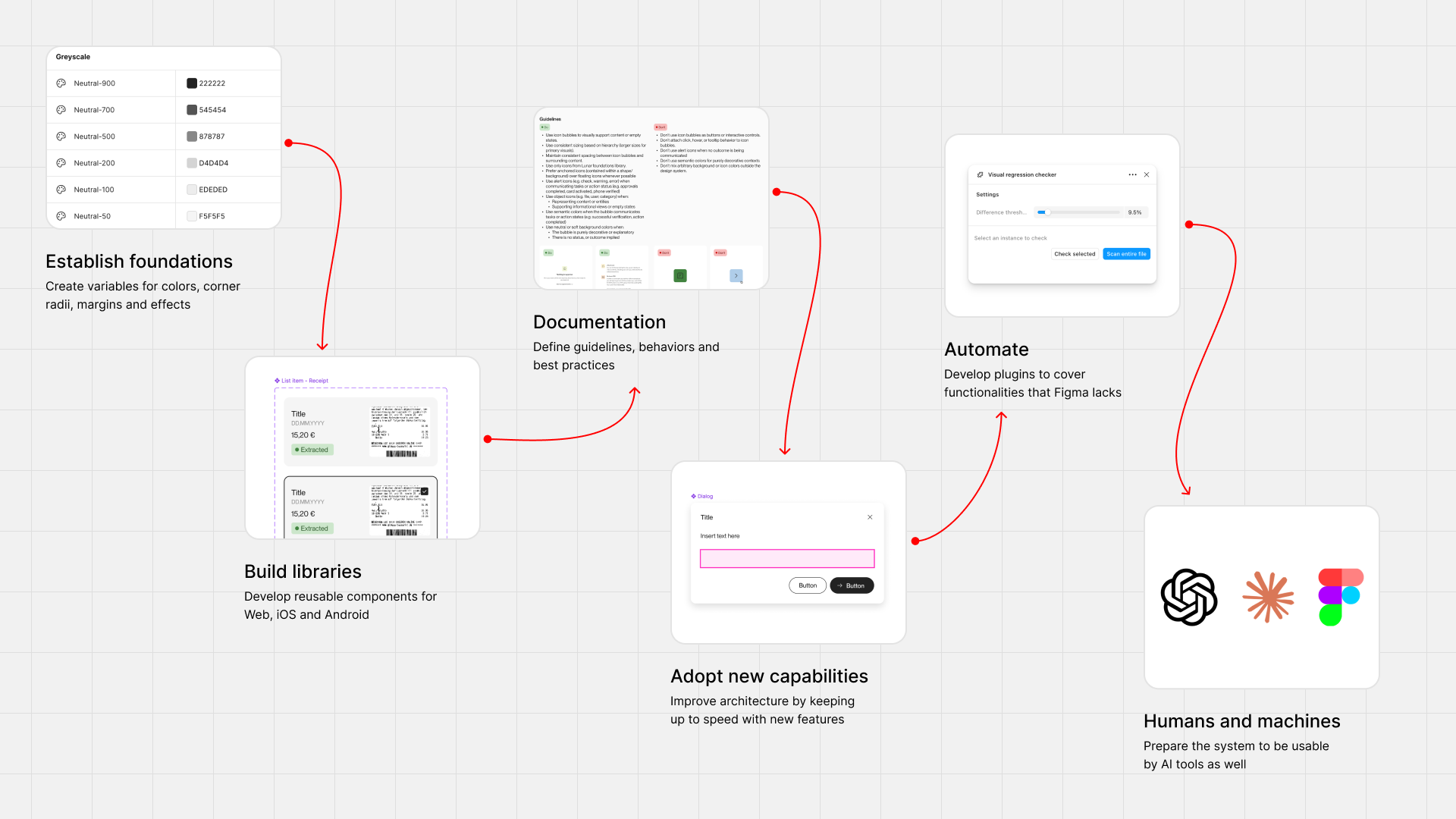
The roadmap covered six stages:
Establish foundations: Create a shared library of colors, icons, spacing, corner radii, and shadow variables.
Build component libraries: Develop reusable components for Web, iOS, and Android.
Document the system: Define component behavior, variants, usage guidelines, and accessibility considerations.
Adopt new Figma capabilities: Continuously improve component architecture using features such as Slots.
Automate maintenance: Develop AI-assisted Figma plugins to reduce repetitive work and improve quality assurance.
Prepare for human and machine consumption: Structure Lunar to be understandable and usable by both designers and AI-powered tools.
The visual direction was developed collaboratively with the Design team, while I took ownership of building, documenting, and maintaining the system.
This incremental approach allowed Lunar to become useful early while continuously evolving toward a more comprehensive and scalable design system.
Understanding our users
Building Lunar required understanding how different teams used design components throughout product development.
Designers needed reliable, flexible components that accelerated their work without limiting their creativity. Components had to be easy to discover, configure, and maintain.
Engineers needed clear specifications and predictable component behavior. Particularly on mobile, aligning Figma components with their implemented counterparts helped reduce ambiguity and improve collaboration.
QA needed a trustworthy reference for validating implementations. By establishing consistent component states, variants, and documentation, Lunar could serve as a source of truth when reviewing the final product.
These needs influenced how I structured components, defined their properties, and documented their behavior. The goal wasn't simply to make components reusable, but to make them useful throughout the entire product development process.
Results & impact
Lunar transformed a fragmented collection of UI components into a comprehensive design system supporting Web, iOS, and Android.
Its impact extended beyond visual consistency, improving how Design, Engineering, and QA collaborated throughout product development.
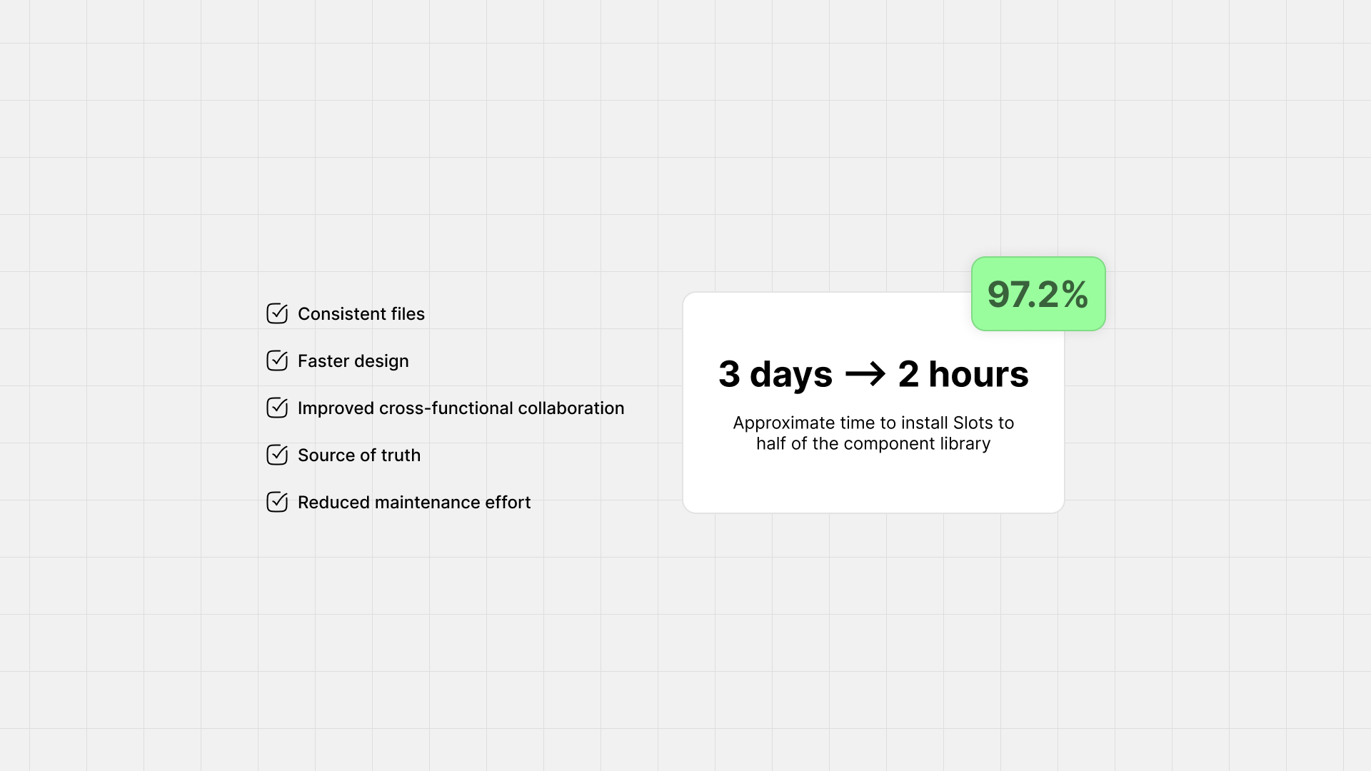
Greater consistency: Shared foundations and reusable components established a unified visual language across platforms.
Faster design workflows: Designers could build interfaces using reliable components instead of repeatedly recreating existing patterns.
Improved Design–Engineering collaboration: Better alignment between Figma and implemented components, particularly on mobile, reduced ambiguity.
A reliable source of truth: Documented components and states gave QA a consistent reference for validating implementations.
Significantly reduced maintenance effort: During a component migration, manually updating half the library took approximately three days. After developing a custom Figma plugin, I completed the remaining half in just two hours.
Beyond these improvements, Lunar established a scalable foundation that could evolve alongside the product, making future changes easier to introduce and maintain.
Building and evolving Lunar
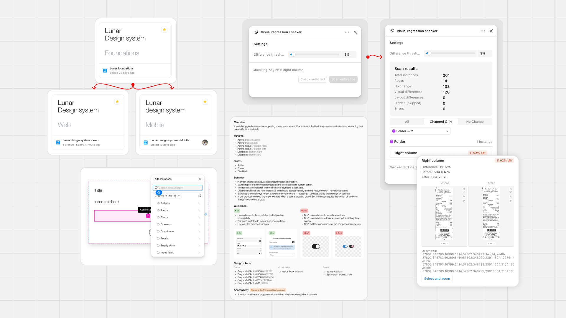
Lunar evolved through a series of iterations, each addressing a different challenge in scalability, usability, or maintenance.
Establishing the foundations
I started by creating a centralized foundations library, introducing Figma Variables for colors, spacing, corner radii, and shadows, alongside a consistent icon library.
This replaced fragmented styles with a shared set of design decisions, making global changes easier and establishing a consistent visual language across platforms.
Building the component libraries
I built dedicated component libraries for Web, iOS, and Android, translating the team's visual direction into reusable, configurable components.
Particular attention went into component architecture, variants, states, and properties. On mobile and web, I worked to align Figma components more closely with their native implementation, improving consistency between Design and Engineering.
Documenting the system
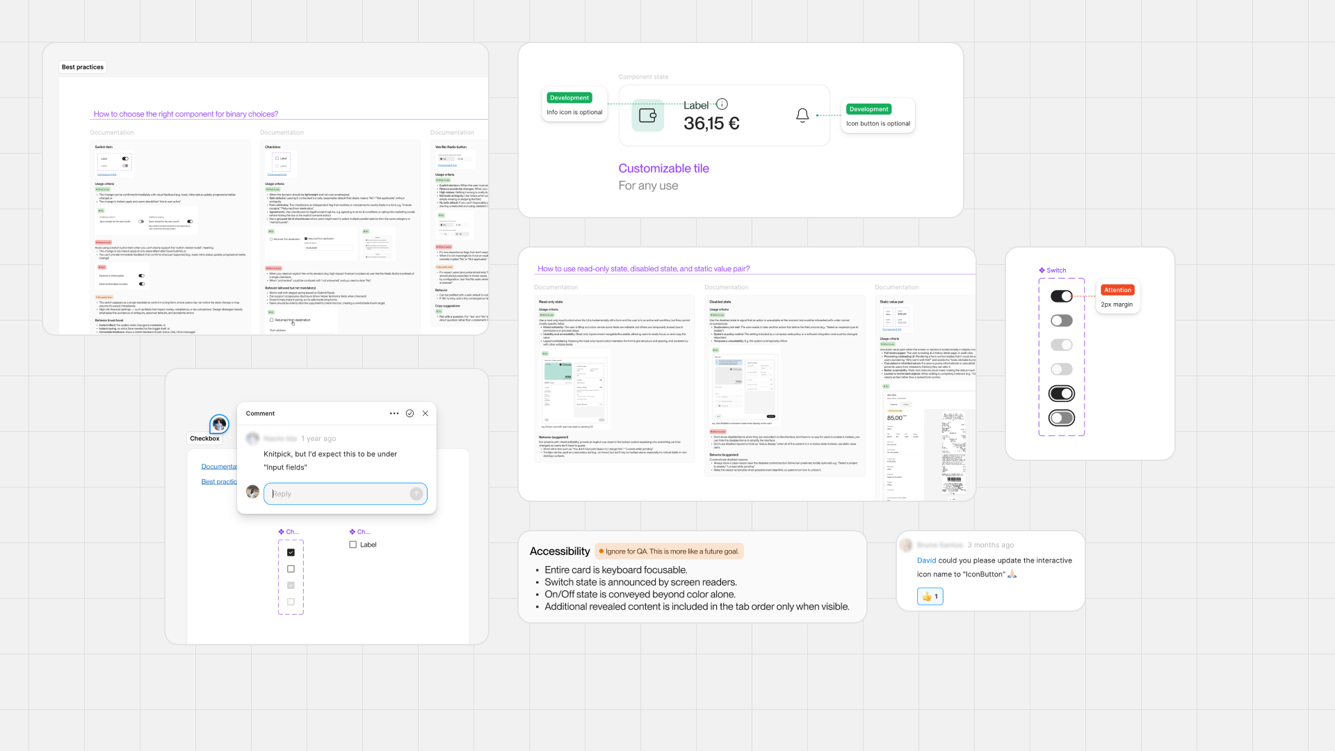
I established a consistent documentation structure covering component variants, states, behavior, usage guidelines, and accessibility.
I also created a central Confluence guide to help designers navigate Lunar, understand how to use it, and request new components or improvements. This established a shared entry point for the system beyond Figma
This transformed Lunar from a collection of components into a system that designers could understand and use independently, while providing engineers and QA with clearer implementation references.
Improving component architecture
As Figma introduced new capabilities, I continued evolving Lunar rather than treating the initial implementation as final.
For example, adopting Slots allowed me to simplify component structures and make them more flexible, reducing the need for excessive variants and improving maintainability.
Automating maintenance with AI
Maintaining a growing design system introduced significant repetitive work. To address this, I developed custom Figma plugins that automated tasks such as component migrations, documentation updates, and visual regression testing.
These tools reduced manual effort, made large-scale changes easier to manage, and helped maintain consistency across the libraries.
Preparing for AI-powered workflows
The next planned evolution was to make Lunar easier for both humans and AI-powered tools to understand and use.
I began exploring how clearer component structures, consistent naming, and machine-readable documentation could support automated design workflows and improve collaboration between design systems and AI tools.
Although this work was interrupted before completion, it established a direction for Lunar's future development.
Looking back
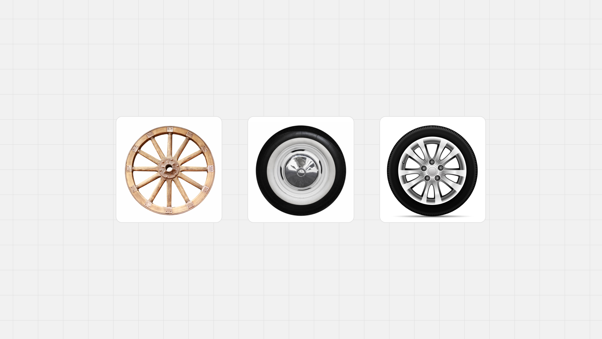
Building Lunar reinforced my belief that a design system is a product, not just a collection of components. Its value comes not only from visual consistency but also from how effectively it supports the people who use and maintain it.
One of my biggest learnings was the importance of incremental evolution. Starting with a component library allowed me to address immediate problems, while the rebranding created an opportunity to establish a more ambitious and scalable foundation.
I also discovered how much value designers can create by going beyond traditional design tools. Developing custom plugins allowed me to automate repetitive work, improve quality assurance, and dedicate more time to solving meaningful design problems.
I'm particularly proud of building something that brought Design, Engineering, and QA closer together. What began as an effort to organize components evolved into shared infrastructure that improved how the entire team worked.